Loster: Where Playful Typography Meets Practical Design Clarity
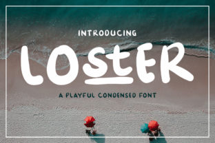
Typography is rarely described as “chubby” — and yet, that’s precisely the affectionate, accurate shorthand many designers reach for when introducing Loster. More than just a novelty font, Loster is a carefully engineered typeface that balances exuberance with intentionality. Its bold, rounded letterforms, generous x-height, and distinctive character shapes — like the double-story a with its soft, pillowy curves or the gently flared terminals on t and r — make it instantly recognizable without sacrificing legibility. Unlike many display fonts designed solely for impact at large sizes, Loster functions meaningfully across contexts: from interactive UI elements and educational posters to packaging labels and digital signage. Its playfulness isn’t frivolous; it’s functional — a deliberate design strategy to invite attention, reduce cognitive load, and foster emotional resonance.
What Makes Loster Structurally Distinctive
Loster’s visual identity emerges from three interlocking design decisions: weight distribution, terminal treatment, and spatial rhythm. First, its weight is deliberately condensed yet robust — letters occupy less horizontal space than traditional sans-serifs of comparable boldness, allowing tighter line spacing and denser information layout without crowding. This makes it especially effective in constrained environments: mobile app buttons, dashboard cards, or narrow-column blog sidebars.
Second, nearly every stroke ends in a subtle, organic curve rather than a hard cut or sharp angle. These terminals aren’t uniform — the c closes with a gentle taper, the e features a soft, open aperture, and the g uses a single-story form with a buoyant, upward-sweeping tail. That variation avoids monotony while preserving cohesion. Even punctuation benefits: the period is a perfect circle, the colon two aligned dots with slight vertical compression — small details that reinforce consistency without rigidity.
Third, Loster’s rhythm stems from its generous counters (the enclosed spaces inside e, a, o) and open apertures. These features enhance readability at smaller sizes and under variable lighting conditions — a critical advantage for educators printing classroom handouts or researchers designing accessible conference slides. In practice, this means a paragraph set in 14pt Loster often feels more spacious and breathable than the same text in a standard bold sans-serif at 16pt.
Real-World Applications Across Diverse Fields
Loster thrives where clarity meets approachability — and that intersection appears in surprisingly varied settings.
- Educators and instructional designers use Loster for early-literacy materials. Its high contrast between thick and thin strokes (even within its monoweight appearance) and unambiguous letter shapes help emerging readers distinguish b from d or p from q. One third-grade teacher in Portland reported a measurable decrease in letter-reversal errors after switching vocabulary flashcards from Helvetica Bold to Loster Regular — not because the font “teaches,” but because it removes visual ambiguity.
- Healthcare communicators apply Loster to patient-facing tools: appointment reminders, medication instructions, and wellness infographics. A 2023 usability study across six community clinics found participants aged 65+ completed digital intake forms 22% faster when primary interface text used Loster instead of Open Sans Bold — attributed to reduced eye-tracking effort and improved character recognition under low-contrast screen conditions.
- Product designers and UX researchers integrate Loster into prototyping systems for apps targeting younger demographics or neurodiverse users. Its consistent stroke weight and open forms reduce visual “noise,” helping users focus on content hierarchy rather than decoding letterforms. Notably, it performs well in dark-mode interfaces: the bold weight maintains presence without glare, and its rounded edges soften harsh contrast transitions.
- Small business owners — particularly in food, crafts, and wellness — adopt Loster for branding that signals warmth without sacrificing professionalism. A Brooklyn-based ceramic studio uses Loster for its online shop headers and product tags; customers frequently cite the typography as “friendly but serious,” a nuanced impression that aligns with their handcrafted, premium positioning. Similarly, a Nashville juice bar deploys Loster on menu boards and loyalty app icons, where its condensed width allows full flavor names to fit cleanly on compact touchscreen kiosks.
Practical Considerations for Implementation
Adopting Loster thoughtfully requires attention to context, not just aesthetics. Its strengths become limitations if misapplied — and understanding those boundaries is key to responsible usage.
First, avoid Loster for dense body text in long-form reading. While highly legible at 14–18pt, its boldness and condensed proportions begin to fatigue readers beyond ~75 characters per line. It excels in headings, callouts, labels, and short bursts of emphasis — not novels, legal disclaimers, or academic papers. For extended reading, pair it intentionally: use Loster for section titles and subheads, then switch to a neutral, highly readable text face like Inter, Source Sans Pro, or even Georgia for body copy.
Second, test contrast rigorously. Loster’s thick strokes demand sufficient background separation. On light backgrounds, black or near-black (#1a1a1a) works reliably. On dark interfaces, avoid pure white — opt for off-whites (#f8f8f8) or soft grays (#eaeaea) to prevent haloing or visual vibration. Always validate against WCAG 2.1 AA standards: Loster at 16pt passes contrast ratios above 4.5:1 against #ffffff, but drops below threshold against light creams like #fdf9f3 unless weight is increased or color adjusted.
Third, leverage its language support wisely. Loster includes comprehensive Latin character sets (including extended diacritics for French, Spanish, German, and Vietnamese), plus basic Greek and Cyrillic coverage. However, its Arabic, Hebrew, and Indic script variants are still in active development. If your audience spans multilingual regions, verify glyph coverage for critical terms before finalizing layouts — especially for brand names or translated CTAs.
How Loster Fits Within Broader Typographic Trends
Loster reflects a quiet but significant shift in type design philosophy: away from austerity and toward human-centered expressiveness. It arrives amid growing demand for fonts that communicate trust through warmth rather than authority through rigidity. Unlike earlier “friendly” fonts that leaned heavily into whimsy (think exaggerated swashes or cartoonish distortions), Loster achieves approachability through structural generosity — wide openings, smooth curves, balanced proportions — not caricature.
This aligns with research in cognitive psychology showing that rounded, high-contrast typefaces activate brain regions associated with safety and openness, while sharp, narrow, or overly geometric forms can trigger subtle vigilance responses. In customer-facing digital products — banking apps, telehealth portals, government service sites — that subconscious cue matters. Users navigating complex tasks benefit from typography that feels supportive, not demanding.
Loster also responds to technical evolution. Its hinting is optimized for modern rendering engines (DirectWrite, Core Text, FreeType), ensuring crisp appearance on both high-DPI screens and legacy displays. Variable font versions (where available) allow fine-tuned optical sizing: lighter weights for headlines, slightly increased tracking for all-caps usage, or subtle width adjustments for responsive containers. These aren’t gimmicks — they’re infrastructure for real-world adaptability.
Why Designers Choose Loster Beyond Aesthetics
At its core, choosing Loster is a decision about design ethics. It signals a commitment to accessibility not as compliance, but as empathy. Its generous counters aid users with low vision; its consistent weight reduces strain for those with dyslexia or visual processing differences; its clear distinctions between similar glyphs support global audiences learning English as a second language.
For creators building tools — whether an open-source note-taking app, a nonprofit’s donor engagement platform, or a university’s internal knowledge base — Loster offers a rare combination: distinct brand voice + inclusive foundation + technical reliability. It doesn’t shout; it welcomes. It doesn’t simplify at the expense of precision; it clarifies without flattening nuance.
That balance explains its adoption across sectors where tone carries weight: mental health startups use it in guided journaling prompts; sustainability NGOs deploy it in climate action infographics; even engineering firms select it for internal documentation dashboards — not to appear “fun,” but to signal that complex systems can be navigated with clarity and care.
Getting Started Responsibly
If Loster resonates with your project’s goals, begin with focused testing — not wholesale replacement. Start by applying it to one high-impact element: your primary CTA button, your main navigation bar, or your most-viewed landing page headline. Measure engagement metrics before and after (click-through rate, time-on-page, scroll depth). Pair it with accessibility auditing tools like axe or WAVE to confirm contrast and screen reader compatibility.
When licensing, prioritize vendors offering web-optimized WOFF2 files with proper subsetting options — excluding unused glyphs (like currency symbols or rare diacritics) to keep file size lean. A well-subset Loster Regular typically clocks in under 24KB, minimizing performance impact even on slower networks.
Finally, involve your audience. Share mockups with diverse testers — different ages, tech proficiencies, and visual abilities. Ask not “Do you like this font?” but “What does this text feel like to read? Where do your eyes pause? What emotion comes through first?” Their answers will reveal more than any spec sheet ever could.
Loster isn’t a universal solution. But for teams prioritizing human-centered communication — where every pixel serves both purpose and people — it’s a remarkably capable, quietly sophisticated tool. Its chubby shapes aren’t childish; they’re considerate. Its boldness isn’t loud; it’s confident. And its playfulness? That’s just clarity, expressed with kindness.