Flohart: The Brush Display Font That Adds Casual Charm—Without the Common Pitfalls
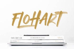
Flohart isn’t just another brush script font—it’s a thoughtfully crafted display typeface that balances spontaneity with clarity. With its lively, hand-drawn strokes and relaxed rhythm, Flohart brings warmth and personality to headlines, logos, social graphics, packaging, and invitations. But here’s what many overlook: its strength lies not in how it looks at first glance, but in how intentionally it’s used. Too often, designers fall into habits that mute its charm—or worse, undermine readability and brand cohesion.
Assuming Flohart Works Everywhere (It Doesn’t)
Flohart is a display font—designed for impact, not endurance. Using it for body text, long paragraphs, or small UI labels creates strain for readers and dilutes its expressive power. You’ll see it misapplied in blog headers set at 14px, product descriptions on e-commerce sites, or mobile app menus. These choices don’t just look off—they reduce comprehension, increase bounce rates, and weaken trust.
Instead, reserve Flohart for moments where tone and attention matter most: a hero section headline, a hand-crafted logo lockup, an Instagram story overlay, or a boutique café menu title. Pair it with a clean, highly legible sans serif (like Inter, Poppins, or Lato) for supporting text. This contrast doesn’t compete—it complements. Your message stays clear; your style stays distinctive.
Overlooking Licensing Before Downloading or Buying
Flohart is available in both free and premium versions—but the difference isn’t just price. Free variants often lack full character sets (no accented letters, no numerals, minimal punctuation), offer limited weights, and come with restrictive licenses—especially for commercial use, merchandise, or digital products. One freelancer assumed their “free Flohart” download covered client work—only to receive a cease-and-desist after using it on branded tote bags.
Before downloading or purchasing, check three things: 1) Does the license explicitly permit your intended use? (e.g., web embedding, app integration, print + digital resale); 2) Does it include OpenType features like ligatures or stylistic alternates? (These add polish without extra effort); 3) Is technical support or updates included? Reputable foundries often provide timely fixes and format compatibility across platforms.
Ignoring Contextual Contrast and Color Contrast
Flohart’s brush texture thrives against simple, uncluttered backgrounds—but it fades fast when placed over busy photos, gradients, or low-contrast colors. A common mistake is dropping Flohart in light gray (#CCCCCC) on a white background, then wondering why it feels “weak” or “washed out.” Its casual energy needs visual breathing room and sufficient contrast to land.
Test it early: zoom out to 25% view—does the shape still read as a word? Try Flohart in solid black or deep charcoal on white, or crisp white on rich navy or forest green. Avoid thin strokes over textured overlays unless you’ve manually adjusted stroke weight or added subtle drop shadows (sparingly). And never rely solely on default font rendering—preview how it appears on iOS vs. Android, or in Safari vs. Chrome. Subtle hinting differences can soften edges or break connections between letters.
Misjudging File Format Needs
Flohart performs best as a webfont (WOFF2) for websites, but many users grab the desktop OTF and try to embed it directly—causing slow load times, layout shifts, or fallback failures. Others assume one file fits all: using the same variable font instance for both high-res print and responsive web layouts, without adjusting optical sizing or weight interpolation.
For websites: serve Flohart via a reliable CDN or self-host with proper @font-face declarations—including font-display: swap so text remains visible during loading. For print: export from design software using outlined vectors or embedded fonts—not screen captures. For apps: confirm whether Flohart supports dynamic type scaling and accessibility settings (e.g., bold text toggles, VoiceOver compatibility).
Skipping Kerning and Spacing Adjustments
Flohart includes thoughtful default spacing—but automatic tracking rarely matches real-world context. Tight headlines may need slight letter-spacing (+10–20 units) to avoid crowding; longer phrases might benefit from manual kerning pairs (like “To”, “Wa”, or “Fr”) to prevent awkward gaps or collisions. One educator used Flohart for an online course title banner—only to realize “Learn & Grow” looked like “Lear n&Grow” due to uneven spacing around the ampersand.
Don’t skip this step—even if you’re not a typography expert. Most design tools (Figma, Adobe Illustrator, Canva Pro) let you adjust tracking with sliders or apply auto-kerning presets. In CSS, use letter-spacing judiciously (not as a global rule), and test on multiple devices. Better yet: set up a reusable Flohart style guide for your team—defining approved sizes, spacing ranges, and pairing rules.
Underestimating How It Scales Across Sizes
Flohart shines at 48px and above—but below 32px, its brush details begin to blur or pixelate, especially on non-Retina screens. Yet some marketers use it for email subject lines or mobile push notifications, assuming “it’ll look fine.” It won’t. At small sizes, Flohart loses its identity and becomes indistinct.
If you need a friendly, approachable voice at smaller scales, pair Flohart with a companion sans that shares its x-height and warmth—like Manrope or Quicksand. Use Flohart only where size and resolution support its expressive nature. When in doubt, mock it up at actual device dimensions—not just desktop previews.
A Final Practical Check Before You Commit
Before licensing Flohart—or any display font—ask yourself:
- Does it support the languages and characters my audience uses? (Check diacritics, currency symbols, and localized punctuation.)
- Have I tested it alongside my brand’s primary and secondary typefaces—not just side-by-side, but in real layouts?
- Is the foundry transparent about updates, licensing tiers, and usage limits?
- Can I easily access alternate glyphs (swashes, terminals, contextual forms) without complex OpenType setup?
- Does it render consistently across the browsers and devices my users actually rely on?
Flohart earns its place when treated with intention—not as decoration, but as deliberate voice. It’s not about making something “look creative.” It’s about reinforcing tone, guiding attention, and connecting authentically—with less effort and more impact. Choose wisely, test thoroughly, and let its casual confidence do the work.